Сравнение популярных оконных библиотек React для эффективного рендеринга больших списков и табличных данных

Производительность определяется тем, насколько эффективно программное обеспечение может выполнять свои задачи. В веб-разработке производительность измеряется тем, насколько быстро загружается начальная веб-страница и насколько быстро она реагирует на действия пользователя.
Для отображения всего содержимого большого списка или табличных данных может потребоваться много времени. Работа с окнами, также называемая виртуализацией, — это метод, помогающий в подобных ситуациях. то есть он отображает только небольшое подмножество данных в любой момент времени, что может значительно сократить время, необходимое для визуализации компонентов, с меньшим количеством создаваемых узлов DOM.
react-window, react-virtualized и react-virtuoso — популярные оконные библиотеки. На следующей диаграмме трендов npm сравниваются три библиотеки:

Брайан Вон написал и react-window, и react-virtualized. react-virtualized громоздкий с полной функциональностью. react-window — это полностью переработанная версия react-virtualized, направленная на то, чтобы сделать пакет меньше и быстрее. Если react-window обеспечивает достаточную функциональность для проекта, настоятельно рекомендуется использовать react-window вместо react-virtualized.
react-virtuoso новее. Петьо Иванов, автор, сказал, что его цель состоит в том, чтобы общие случаи работали из коробки, что не заставляло пользователя прыгать через ненужные обручи, которые легко решить изнутри. Приятно иметь возможность не жестко задавать высоту, в то время как useWindowScroll автоматически использует скроллер документов.
Давайте посмотрим, как работают эти библиотеки:
• React-Window
 - FixedSizeList and VariableSizeList
 - FixedSizeGrid and VariableSizeGrid

• React-Virtualized
 - List
 - Grid
 - Table
 - Collection and Masonry
 - AutoSizer
 - Other Helpers and Decorators

• React-Virtuoso
 - Virtuoso
 - GroupedVirtuoso
 - TableVirtuoso
 - VirtuosoGrid
Окно реакции
react-window — это набор компонентов React для эффективного рендеринга больших списков и табличных данных. Он отображает часть большого набора данных, достаточного, чтобы заполнить область просмотра:
- Это сокращает объем работы и время, необходимое для визуализации исходного вида и обработки обновлений.
- Это уменьшает объем памяти, избегая чрезмерного выделения узлов DOM.
Настройте рабочую среду Создать React App:
% yarn create react-app react-virtual-data
% cd react-virtual-data
Установите пакет, react-window:
% yarn add react-window
Он становится частью dependencies в package.json:
"dependencies": {
  "react-window": "^1.8.9"
}
react-window — небольшая библиотека. Согласно https://bundlephobia.com/, его размер в сжатом виде составляет 6,4 КБ. По умолчанию react-window состоит из четырех компонентов: FixedSizeList, VariableSizeList, FixedSizeGrid и VariableSizeGrid.
FixedSizeList и VariableSizeList
FixedSizeList отображает виртуализированный список элементов. Он может прокручиваться вертикально.

Он также может прокручиваться по горизонтали.

VariableSizeList похож на FixedSizeList, но с дополнительными элементами управления, включая размер элемента, который может быть переменным. Он может прокручиваться вертикально.

Он также может прокручиваться по горизонтали.

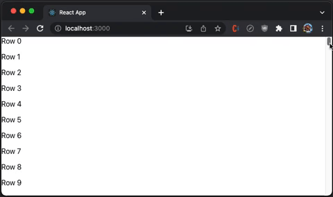
Следующий src/App.js создает файл FixedSizeList.
import { FixedSizeList as List } from 'react-window';

const Row = ({ index, style }) => <div style={style}>Row {index}</div>;

function App() {
  return (
    <List
      height={350}
      itemCount={1000}
      // overscanCount specifies items slightly outside of visible area to
      // reduce or prevent a flash of empty space during scrolling
      // overscanCount={20}
      width="100%"
    >
      {/* if list items are expensive to render, React.memo can be used to
      generate the Row component to avoid unnecessary re-rendering */}
      {Row}
    </List>
  );
}
export default App;
Выполняем yarn start, и видим виртуализированный список с вертикальной прокруткой:
Вот определение ListProps:
export interface ListProps<T = any> extends CommonProps<T> {
  /**
   * React component responsible for rendering the individual item specified by an index prop. This component also receives a style prop (used for positioning).
   *
   * If useIsScrolling is enabled for the list, the component also receives an additional isScrolling boolean prop.
   */
  children: ComponentType<ListChildComponentProps<T>>;
  /**
   * Height of the list.
   *
   * For vertical lists, this must be a number. It affects the number of rows that will be rendered (and displayed) at any given time.
   *
   * For horizontal lists, this can be a number or a string (e.g. "50%").
   */
  height: number | string;
  /**
   * Total number of items in the list. Note that only a few items will be rendered and displayed at a time.
   */
  itemCount: number;
  /**
   * Width of the list.
   *
   * For horizontal lists, this must be a number. It affects the number of columns that will be rendered (and displayed) at any given time.
   *
   * For vertical lists, this can be a number or a string (e.g. "50%").
   */
  width: number | string;
  /**
   * Determines the direction of text and horizontal scrolling.
   *
   * This property also automatically sets the CSS direction style for the list component.
   *
   * Specifying "horizontal" or "vertical" for this value is deprecated. Use "layout" prop instead.
   *
   * @default "ltr"
   */
  direction?: CSSDirection | Direction | undefined;
  /**
   * Layout/orientation of the list.
   *
   * Acceptable values are:
   * - "vertical" (default) - Up/down scrolling.
   * - "horizontal" - Left/right scrolling.
   *
   * Note that lists may scroll in both directions (depending on CSS) but content will only be windowed in the layout direction specified.
   */
  layout?: Layout | undefined;
  /**
   * Scroll offset for initial render.
   *
   * For vertical lists, this affects scrollTop. For horizontal lists, this affects scrollLeft.
   */
  initialScrollOffset?: number | undefined;
  /**
   * By default, lists will use an item's index as its key. This is okay if:
   *
   * - Your collections of items is never sorted or modified
   * - Your item renderer is not stateful and does not extend PureComponent
   *
   * If your list does not satisfy the above constraints, use the itemKey property to specify your own keys for items
   */
  itemKey?: ListItemKeySelector<T> | undefined;
  /**
   * The number of Overscanning slightly can reduce or prevent a flash of empty space when a user first starts scrolling. (rows or columns) to render outside of the visible area. This property can be important for two reasons:
   *
   * - Overscanning by one row or column allows the tab key to focus on the next (not yet visible) item.
   * - Overscanning slightly can reduce or prevent a flash of empty space when a user first starts scrolling.
   *
   * Note that overscanning too much can negatively impact performance. By default, List overscans by one item.
   */
  overscanCount?: number | undefined;
  /**
   * Called when the items rendered by the list change.
   */
  onItemsRendered?: ((props: ListOnItemsRenderedProps) => any) | undefined;
  /**
   * Called when the list scroll positions changes, as a result of user scrolling or scroll-to method calls.
   */
  onScroll?: ((props: ListOnScrollProps) => any) | undefined;
}
VariableSizeListProps расширяет VariableSizeListProps, где itemSize — это функция для создания списка переменного размера.
export interface VariableSizeListProps<T = any> extends ListProps<T> {
  /**
   * Estimated size of a item in the direction being windowed. For vertical lists, this is the row height. For horizontal lists, this is the column width.
   *
   * This value is used to calculated the estimated total size of a list before its items have all been measured. The total size impacts user scrolling behavior.
   * It is updated whenever new items are measured.
   */
  estimatedItemSize?: number | undefined;
  /**
   * Returns the size of a item in the direction being windowed. For vertical lists, this is the row height. For horizontal lists, this is the column width.
   */
  itemSize: (index: number) => number;
}
В предыдущей статье мы использовали FixedSizeList для реализации бесконечной прокрутки для React Table.
FixedSizeGrid и VariableSizeGrid
FixedSizeGrid отображает виртуализированную сетку, которая может прокручиваться вертикально и горизонтально.

VariableSizeGrid похож на FixedSizeGrid, но с дополнительными элементами управления, включая размер сетки, который может быть переменным.

Следующий src/App.js создает файл FixedSizeGrid.
import { FixedSizeGrid as Grid } from 'react-window';

const Cell = ({ columnIndex, rowIndex, style }) => (
  <div style={style}>
    Item {rowIndex},{columnIndex}
  </div>
);

function App() {
  return (
    <Grid
      columnCount={1000}
      columnWidth={100}
      height={350}
      rowCount={1000}
      rowHeight={35}
      // overscanColumnCount and overscanRowCount specify items slightly
      // outside of visible area to reduce or prevent a flash of empty space
      // during scrolling
      // overscanColumnCount={20}
      // overscanRowCount={20}
      width={730}
    >
      {Cell}
    </Grid>
  );
}
export default App;
Выполняем yarn start, и видим виртуализированную сетку с вертикальной и горизонтальной прокруткой:

Вот определение GridProps:
export interface GridProps<T = any> extends CommonProps<T> {
  /**
   * React component responsible for rendering the individual item specified by an index prop. This component also receives a style prop (used for positioning).
   *
   * If useIsScrolling is enabled for the list, the component also receives an additional isScrolling boolean prop.
   */
  children: ComponentType<GridChildComponentProps<T>>;
  /**
   * Number of columns in the grid. Note that only a few columns will be rendered and displayed at a time.
   */
  columnCount: number;
  /**
   * Determines the direction of text and horizontal scrolling.
   *
   * This property also automatically sets the CSS direction style for the grid component.
   *
   * @default "ltr"
   */
  direction?: CSSDirection | undefined;
  /**
   * Height of the grid. This affects the number of rows that will be rendered (and displayed) at any given time.
   */
  height: number;
  /**
   * Horizontal scroll offset for initial render.
   */
  initialScrollLeft?: number | undefined;
  /**
   * Vertical scroll offset for initial render.
   */
  initialScrollTop?: number | undefined;
  /**
   * By default, grids will use an item's indices as its key. This is okay if:
   *
   * - Your collections of items is never sorted or modified
   * - Your item renderer is not stateful and does not extend PureComponent
   *
   * If your grid does not satisfy the above constraints, use the itemKey property to specify your own keys for items.
   */
  itemKey?: GridItemKeySelector<T> | undefined;
  /**
   * Called when the items rendered by the grid change.
   */
  onItemsRendered?: ((props: GridOnItemsRenderedProps) => any) | undefined;
  /**
   * Called when the grid scroll positions changes, as a result of user scrolling or scroll-to method calls.
   */
  onScroll?: ((props: GridOnScrollProps) => any) | undefined;
  /**
   * @deprecated since version 1.8.2, please use overscanColumnCount
   */
  overscanColumnsCount?: number | undefined;
  /**
   * The number of columns to render outside of the visible area. This property can be important for two reasons:
   *
   * - Overscanning by one row or column allows the tab key to focus on the next (not yet visible) item.
   * - Overscanning slightly can reduce or prevent a flash of empty space when a user first starts scrolling.
   *
   * Note that overscanning too much can negatively impact performance. By default, grid overscans by one item.
   */
  overscanColumnCount?: number | undefined;
  /**
   * @deprecated since version 1.8.2, please use overscanRowCount
   */
  overscanRowsCount?: number | undefined;
  /**
   * The number of rows to render outside of the visible area. This property can be important for two reasons:
   *
   * - Overscanning by one row or column allows the tab key to focus on the next (not yet visible) item.
   * - Overscanning slightly can reduce or prevent a flash of empty space when a user first starts scrolling.
   *
   * Note that overscanning too much can negatively impact performance. By default, grid overscans by one item.
   */
  overscanRowCount?: number | undefined;
  /**
   * The number of items (rows or columns) to render outside of the visible area. This property can be important for two reasons:
   *
   * - Overscanning by one row or column allows the tab key to focus on the next (not yet visible) item.
   * - Overscanning slightly can reduce or prevent a flash of empty space when a user first starts scrolling.
   *
   * Note that overscanning too much can negatively impact performance. By default, grid overscans by one item.
   *
   * @deprecated since version 1.4.0
   */
  overscanCount?: number | undefined;
  /**
   * Number of rows in the grid. Note that only a few rows will be rendered and displayed at a time.
   */
  rowCount: number;
  /**
   * Width of the grid. This affects the number of columns that will be rendered (and displayed) at any given time.
   */
  width: number;
}
VariableSizeGridProps расширяет GridProps, где columnWidth и rowHeight — функции для создания сетки переменного размера.
export interface VariableSizeGridProps<T = any> extends GridProps<T> {
  /**
   * Returns the width of the specified column.
   */
  columnWidth: (index: number) => number;
  /**
   * Average (or estimated) column width for unrendered columns.
   *
   * This value is used to calculated the estimated total width of a Grid before its columns have all been measured.
   * The estimated width impacts user scrolling behavior. It is updated whenever new columns are measured.
   */
  estimatedColumnWidth?: number | undefined;
  /**
   * Average (or estimated) row height for unrendered rows.
   *
   * This value is used to calculated the estimated total height of a Grid before its rows have all been measured.
   * The estimated height impacts user scrolling behavior. It is updated whenever new rows are measured.
   */
  estimatedRowHeight?: number | undefined;
  /**
   * Returns the height of the specified row.
   */
  rowHeight: (index: number) => number;
}
В предыдущей статье VariableSizeGrid используется для реализации бесконечной прокрутки для Ant Table.
React-виртуализированный
react-virtualized также представляет собой набор компонентов React для эффективного рендеринга больших списков и табличных данных. Он отображает часть большого набора данных, достаточного для заполнения окна просмотра.
Установите пакет, react-virtualized:
% yarn add react-virtualized
Он становится частью dependencies в package.json:
"dependencies": {
  "react-virtualized": "^9.22.5"
}
react-virtualized является прецедентом react-window. Он громоздкий с полным функционалом. Согласно https://bundlephobia.com/, его размер в сжатом виде составляет 27,3 КБ. По умолчанию react-virtualized имеет 5 основных компонентов, Collection, Grid, List, Masonry и Table, а также 8 компонентов высокого порядка, которые помогают или украшают основные компоненты, AutoSizer, ArrowKeyStepper, CellMeasurer, ColumnSizer, InfiniteLoader, MultiGrid, ScrollSync и WindowScroller.
Список
List отображает виртуализированный список элементов. Он может иметь фиксированную высоту строки.

Он также может иметь динамическую высоту строки.

Следующий src/App.js создает файл List.
import { AutoSizer, List } from 'react-virtualized';

const Row = ({ index, style }) => <div style={style}>Row {index}</div>;
function App() {
  return (
    <AutoSizer disableHeight>
      {({ width }) => (
        <List
          height={350}
          rowCount={1000}
          rowHeight={35} // a function can create a variable size list
          rowRenderer={Row}
          // overscanCount specifies items slightly outside of visible area to
          // reduce or prevent a flash of empty space during scrolling
          // overscanRowCount={20}
          width={width}
        />
      )}
    </AutoSizer>
  );
}
export default App;
Выполняем yarn start, и видим виртуализированный список с вертикальной прокруткой:
Внутри List использует Grid для рендеринга строк и всех реквизитов. Требуется GridProps.
export interface GridProps<T = any> extends CommonProps<T> {
  /**
   * React component responsible for rendering the individual item specified by an index prop. This component also receives a style prop (used for positioning).
   *
   * If useIsScrolling is enabled for the list, the component also receives an additional isScrolling boolean prop.
   */
  children: ComponentType<GridChildComponentProps<T>>;
  /**
   * Number of columns in the grid. Note that only a few columns will be rendered and displayed at a time.
   */
  columnCount: number;
  /**
   * Determines the direction of text and horizontal scrolling.
   *
   * This property also automatically sets the CSS direction style for the grid component.
   *
   * @default "ltr"
   */
  direction?: CSSDirection | undefined;
  /**
   * Height of the grid. This affects the number of rows that will be rendered (and displayed) at any given time.
   */
  height: number;
  /**
   * Horizontal scroll offset for initial render.
   */
  initialScrollLeft?: number | undefined;
  /**
   * Vertical scroll offset for initial render.
   */
  initialScrollTop?: number | undefined;
  /**
   * By default, grids will use an item's indices as its key. This is okay if:
   *
   * - Your collections of items is never sorted or modified
   * - Your item renderer is not stateful and does not extend PureComponent
   *
   * If your grid does not satisfy the above constraints, use the itemKey property to specify your own keys for items.
   */
  itemKey?: GridItemKeySelector<T> | undefined;
  /**
   * Called when the items rendered by the grid change.
   */
  onItemsRendered?: ((props: GridOnItemsRenderedProps) => any) | undefined;
  /**
   * Called when the grid scroll positions changes, as a result of user scrolling or scroll-to method calls.
   */
  onScroll?: ((props: GridOnScrollProps) => any) | undefined;
  /**
   * @deprecated since version 1.8.2, please use overscanColumnCount
   */
  overscanColumnsCount?: number | undefined;
  /**
   * The number of columns to render outside of the visible area. This property can be important for two reasons:
   *
   * - Overscanning by one row or column allows the tab key to focus on the next (not yet visible) item.
   * - Overscanning slightly can reduce or prevent a flash of empty space when a user first starts scrolling.
   *
   * Note that overscanning too much can negatively impact performance. By default, grid overscans by one item.
   */
  overscanColumnCount?: number | undefined;
  /**
   * @deprecated since version 1.8.2, please use overscanRowCount
   */
  overscanRowsCount?: number | undefined;
  /**
   * The number of rows to render outside of the visible area. This property can be important for two reasons:
   *
   * - Overscanning by one row or column allows the tab key to focus on the next (not yet visible) item.
   * - Overscanning slightly can reduce or prevent a flash of empty space when a user first starts scrolling.
   *
   * Note that overscanning too much can negatively impact performance. By default, grid overscans by one item.
   */
  overscanRowCount?: number | undefined;
  /**
   * The number of items (rows or columns) to render outside of the visible area. This property can be important for two reasons:
   *
   * - Overscanning by one row or column allows the tab key to focus on the next (not yet visible) item.
   * - Overscanning slightly can reduce or prevent a flash of empty space when a user first starts scrolling.
   *
   * Note that overscanning too much can negatively impact performance. By default, grid overscans by one item.
   *
   * @deprecated since version 1.4.0
   */
  overscanCount?: number | undefined;
  /**
   * Number of rows in the grid. Note that only a few rows will be rendered and displayed at a time.
   */
  rowCount: number;
  /**
   * Width of the grid. This affects the number of columns that will be rendered (and displayed) at any given time.
   */
  width: number;
}
Сетка
Grid отображает виртуализированные табличные данные.

Следующий src/App.js создает файл Grid.
import { AutoSizer, Grid } from 'react-virtualized';

const Cell = ({ columnIndex, rowIndex, style }) => (
  <div style={style}>
    Item {rowIndex},{columnIndex}
  </div>
);

function App() {
  return (
    <AutoSizer disableHeight>
      {({ width }) => (
        <Grid
          columnCount={1000}
          columnWidth={100} // a function can create variable width of columns
          height={350}
          rowCount={1000}
          rowHeight={35} // a function can create variable height of rows
          cellRenderer={Cell}
          // overscanColumnCount and overscanRowCount specifies items slightly
          // outside of visible area to reduce or prevent a flash of empty space
          // during scrolling
          // overscanColumnCount={20}
          // overscanRowCount={20}
          width={width}
        />
      )}
    </AutoSizer>
  );
}
export default App;
Выполняем yarn start, и видим виртуализированную сетку с вертикальной и горизонтальной прокруткой:
Стол
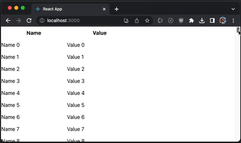
Мы показали двумерное Grid, которое может быть телом таблицы. Table — это компонент с фиксированными заголовками и виртуализированными строками.
Следующий src/App.js создает Table, который имеет два столбца, Name и Value:
import { AutoSizer, Table, Column } from 'react-virtualized';
import 'react-virtualized/styles.css'; // style is needed to show Table layout

const list = Array(1000).fill(1)
  .map((_, index) => ({ name: `Name ${index}`, value: `Value ${index}` }));

function App() {
  return (
    <AutoSizer disableHeight>
      {({ width }) => (
        <Table
          height={350}
          headerHeight={50}
          rowCount={list.length}
          rowGetter={({ index }) => list[index]}
          rowHeight={35}
          // overscanRowCount specifies items slightly outside of visible area
          // to reduce or prevent a flash of empty space during scrolling
          // overscanRowCount={20}
          width={width}
        >
          <Column label="Name" dataKey="name" width={200} />
          <Column label="Value" dataKey="value" width={200} />
        </Table>
      )}
    </AutoSizer>
  );
}
export default App;
Выполняем yarn start, и мы видим виртуализированную таблицу с фиксированным заголовком таблицы:

Вот определение TableProps:
export type TableProps = GridCoreProps & {
  'aria-label'?: string | undefined;
  deferredMeasurementCache?: CellMeasurerCache | undefined;
  /**
   * Removes fixed height from the scrollingContainer so that the total height
   * of rows can stretch the window. Intended for use with WindowScroller
   */
  autoHeight?: boolean | undefined;
  /** One or more Columns describing the data displayed in this row */
  children?: React.ReactNode | undefined;
  /** Optional CSS class name */
  className?: string | undefined;
  /** Disable rendering the header at all */
  disableHeader?: boolean | undefined;
  /**
   * Used to estimate the total height of a Table before all of its rows have actually been measured.
   * The estimated total height is adjusted as rows are rendered.
   */
  estimatedRowSize?: number | undefined;
  /** Optional custom CSS class name to attach to inner Grid element. */
  gridClassName?: string | undefined;
  /** Optional inline style to attach to inner Grid element. */
  gridStyle?: any;
  /** Optional CSS class to apply to all column headers */
  headerClassName?: string | undefined;
  /** Fixed height of header row */
  headerHeight: number;
  /**
   * Responsible for rendering a table row given an array of columns:
   * Should implement the following interface: ({
   *   className: string,
   *   columns: any[],
   *   style: any
   * }): PropTypes.node
   */
  headerRowRenderer?: TableHeaderRowRenderer | undefined;
  /** Optional custom inline style to attach to table header columns. */
  headerStyle?: any;
  /** Fixed/available height for out DOM element */
  height?: number | undefined;
  /** Optional id */
  id?: string | undefined;
  /** Optional renderer to be used in place of table body rows when rowCount is 0 */
  noRowsRenderer?: (() => JSX.Element | null) | undefined;
  /**
   * Optional callback when a column's header is clicked.
   * ({ columnData: any, dataKey: string }): void
   */
  onHeaderClick?: ((params: HeaderMouseEventHandlerParams) => void) | undefined;
  /**
   * Callback invoked when a user clicks on a table row.
   * ({ index: number }): void
   */
  onRowClick?: ((info: RowMouseEventHandlerParams) => void) | undefined;
  /**
   * Callback invoked when a user double-clicks on a table row.
   * ({ index: number }): void
   */
  onRowDoubleClick?: ((info: RowMouseEventHandlerParams) => void) | undefined;
  /**
   * Callback invoked when the mouse leaves a table row.
   * ({ index: number }): void
   */
  onRowMouseOut?: ((info: RowMouseEventHandlerParams) => void) | undefined;
  /**
   * Callback invoked when a user moves the mouse over a table row.
   * ({ index: number }): void
   */
  onRowMouseOver?: ((info: RowMouseEventHandlerParams) => void) | undefined;
  /**
   * Callback invoked with information about the slice of rows that were just rendered.
   * ({ startIndex, stopIndex }): void
   */
  onRowsRendered?: ((info: IndexRange & OverscanIndexRange) => void) | undefined;
  /**
   * Callback invoked whenever the scroll offset changes within the inner scrollable region.
   * This callback can be used to sync scrolling between lists, tables, or grids.
   * ({ clientHeight, scrollHeight, scrollTop }): void
   */
  onScroll?: ((info: ScrollEventData) => void) | undefined;
  /**
   * Number of rows to render above/below the visible bounds of the list.
   * These rows can help for smoother scrolling on touch devices.
   */
  overscanRowCount?: number | undefined;
  /**
   * Optional CSS class to apply to all table rows (including the header row).
   * This property can be a CSS class name (string) or a function that returns a class name.
   * If a function is provided its signature should be: ({ index: number }): string
   */
  rowClassName?: string | ((info: Index) => string) | undefined;
  /**
   * Callback responsible for returning a data row given an index.
   * ({ index: number }): any
   */
  rowGetter?: ((info: Index) => any) | undefined;
  /**
   * Either a fixed row height (number) or a function that returns the height of a row given its index.
   * ({ index: number }): number
   */
  rowHeight: number | ((info: Index) => number);
  /** Number of rows in table. */
  rowCount: number;
  /**
   * Responsible for rendering a table row given an array of columns:
   * Should implement the following interface: ({
   *   className: string,
   *   columns: Array,
   *   index: number,
   *   isScrolling: boolean,
   *   onRowClick: ?Function,
   *   onRowDoubleClick: ?Function,
   *   onRowMouseOver: ?Function,
   *   onRowMouseOut: ?Function,
   *   rowData: any,
   *   style: any
   * }): PropTypes.node
   */
  rowRenderer?: TableRowRenderer | undefined;
  /** Optional custom inline style to attach to table rows. */
  rowStyle?: React.CSSProperties | ((info: Index) => React.CSSProperties) | undefined;
  /** See Grid#scrollToAlignment */
  scrollToAlignment?: string | undefined;
  /** Row index to ensure visible (by forcefully scrolling if necessary) */
  scrollToIndex?: number | undefined;
  /** Vertical offset. */
  scrollTop?: number | undefined;
  /**
   * Sort function to be called if a sortable header is clicked.
   * ({ sortBy: string, sortDirection: SortDirection }): void
   */
  sort?: ((info: { sortBy: string; sortDirection: SortDirectionType }) => void) | undefined;
  /** Table data is currently sorted by this :dataKey (if it is sorted at all) */
  sortBy?: string | undefined;
  /** Table data is currently sorted in this direction (if it is sorted at all) */
  sortDirection?: SortDirectionType | undefined;
  /** Optional inline style */
  style?: React.CSSProperties | undefined;
  /** Tab index for focus */
  tabIndex?: number | null | undefined;
  /** Width of list */
  width?: number | undefined;
};
Очевидно, что Table является ограниченным и ограничительным. Как правило, проект имеет собственный табличный компонент, а List или Grid обеспечивает большую гибкость визуализации.
Коллекция и кладка
Collection отображает разбросанные или нелинейные данные.

Masonry оптимизирован для каменной кладки. Он может использовать компонентный скроллер.

Он также может использовать оконный скроллер без жесткого кодирования высоты.

Авторазмер
AutoSizer автоматически регулирует ширину и высоту одного дочернего элемента. Для многих компонентов react-virtualized требуются явные размеры, но AutoSizer может увеличиваться, чтобы заполнить все доступное пространство.
AutoSizer — наиболее часто используемый помощник, и мы использовали AutoSizer в приведенных выше примерах.
Вот определение AutoSizerProps:
export type AutoSizerProps = {
  /**
   * Function responsible for rendering children.
   * This function should implement the following signature:
   * ({ height, width }) => PropTypes.element
   */
  children: (props: Size) => React.ReactNode;
  /**
   *     Optional custom CSS class name to attach to root AutoSizer element.
   * This is an advanced property and is not typically necessary.
   */
  className?: string | undefined;
  /**
   * Height passed to child for initial render; useful for server-side rendering.
   * This value will be overridden with an accurate height after mounting.
   */
  defaultHeight?: number | undefined;
  /**
   * Width passed to child for initial render; useful for server-side rendering.
   * This value will be overridden with an accurate width after mounting.
   */
  defaultWidth?: number | undefined;
  /** Disable dynamic :height property */
  disableHeight?: boolean | undefined;
  /** Disable dynamic :width property */
  disableWidth?: boolean | undefined;
  /** Nonce of the inlined stylesheet for Content Security Policy */
  nonce?: string | undefined;
  /** Callback to be invoked on-resize: ({ height, width }) */
  onResize?: ((info: Size) => any) | undefined;
  /**
   * Optional custom inline style to attach to root AutoSizer element.
   * This is an advanced property and is not typically necessary.
   */
  style?: React.CSSProperties | undefined;
  /**
   * PLEASE NOTE
   * The [key: string]: any; line is here on purpose
   * This is due to the need of force re-render of PureComponent
   * Check the following link if you want to know more
   * https://github.com/bvaughn/react-virtualized#pass-thru-props
   */
  [key: string]: any;
};
Другие помощники и декораторы
ArrowKeyStepper украшает другой виртуализированный компонент и реагирует на события клавиш со стрелками, прокручивая одну строку или столбец за раз.
CellMeasurer автоматически измеряет содержимое ячейки, временно отображая его невидимым для пользователя способом.
ColumnSizer автоматически вычисляет ширину столбцов для Grid ячеек.
InfiniteLoader управляет своевременной выборкой данных, когда пользователь прокручивает список вверх или вниз.
MultiGrid украшает Grid и добавляет фиксированные столбцы и/или строки.
ScrollSync упрощает процесс синхронизации прокрутки между двумя или более виртуализированными компонентами.
WindowScroller позволяет компонентам Table или List прокручиваться в зависимости от положения прокрутки окна.
React-Виртуоз
react-virtuoso — это набор компонентов React, которые могут отображать огромные наборы данных.
Установите пакет, react-virtuoso:
% yarn add react-virtuoso
Он становится частью dependencies в package.json:
"dependencies": {
  "react-virtuoso": "^4.3.1"
}
react-virtuoso — библиотека среднего размера. Согласно https://bundlephobia.com/, его размер в сжатом виде составляет 16,3 КБ. По умолчанию react-window состоит из четырех основных компонентов: Virtuoso, GroupedVirtuoso, TableVirtuoso и VirtuosoGrid.
Виртуоз
Virtuoso отображает виртуализированный список элементов. Следующий src/App.js создает файл Virtuoso.
import { Virtuoso } from 'react-virtuoso';

function App() {
  return (
    <Virtuoso
      style={{ height: 350 }}
      // useWindowScroll // no need to hardcode the table height in above style
      totalCount={1000}
      itemContent={(index) => <div style={{ height: 35 }}>Row {index}</div>}
      // overscanCount specifies items slightly outside of visible area to
      // reduce or prevent a flash of empty space during scrolling
      // it can be set to a number
      // overscan={20}
      // it can alos be set to an object with different numbers for the main
      // and the reverse scrollable directions
      // overscan={
      //   main: 20,
      //   reverse: 30
      // };
    />
  );
}

export default App;
Выполняем yarn start, и видим виртуализированный список с вертикальной прокруткой:
Вот определение VirtuosoProps:
export declare interface VirtuosoProps<D, C> extends ListRootProps {
  /**
   * The total amount of items to be rendered.
   */
  totalCount?: number;
  /**
   * The data items to be rendered. If data is set, the total count will be inferred from the length of the array.
   */
  data?: readonly D[];
  /**
   * Additional context available in the custom components and content callbacks
   */
  context?: C;
  /**
   * *The property accepts pixel values.*
   *
   * Set the overscan property to make the component "chunk" the rendering of new items on scroll.
   * The property causes the component to render more items than the necessary, but reduces the re-renders on scroll.
   * Setting `{ main: number, reverse: number }` lets you extend the list in both the main and the reverse scrollable directions.
   * See the `increaseViewportBy` property for a similar behavior (equivalent to the `overscan` in react-window).
   *
   */
  overscan?: number | {
    main: number;
    reverse: number;
  };
  /**
   *
   * *The property accepts pixel values.*
   *
   * Set the increaseViewportBy property to artificially increase the viewport size, causing items to be rendered before outside of the viewport.
   * The property causes the component to render more items than the necessary, but can help with slow loading content.
   * Using `{ top?: number, bottom?: number }` lets you set the increase for each end separately.
   *
   */
  increaseViewportBy?: number | {
    top: number;
    bottom: number;
  };
  /**
   * Set the amount of items to remain fixed at the top of the list.
   *
   * For a header that scrolls away when scrolling, check the `components.Header` property.
   */
  topItemCount?: number;
  /**
   * Set to a value between 0 and totalCount - 1 to make the list start scrolled to that item.
   * Pass in an object to achieve additional effects similar to `scrollToIndex`.
   */
  initialTopMostItemIndex?: number | IndexLocationWithAlign;
  /**
   * Set this value to offset the initial location of the list.
   * Warning: using this property will still run a render cycle at the scrollTop: 0 list window.
   * If possible, avoid using it and stick to `initialTopMostItemIndex` instead.
   */
  initialScrollTop?: number;
  /**
   * Use for server-side rendering - if set, the list will render the specified amount of items
   * regardless of the container / item size.
   */
  initialItemCount?: number;
  /**
   * Use the `components` property for advanced customization of the elements rendered by the list.
   */
  components?: Components<D, C>;
  /**
   * Set the callback to specify the contents of the item.
   */
  itemContent?: ItemContent<D, C>;
  /**
   * If specified, the component will use the function to generate the `key` property for each list item.
   */
  computeItemKey?: ComputeItemKey<D, C>;
  /**
   * By default, the component assumes the default item height from the first rendered item (rendering it as a "probe").
   *
   * If the first item turns out to be an outlier (very short or tall), the rest of the rendering will be slower,
   * as multiple passes of rendering should happen for the list to fill the viewport.
   *
   * Setting `defaultItemHeight` causes the component to skip the "probe" rendering and use the property
   * value as default height instead.
   */
  defaultItemHeight?: number;
  /**
   * Allows customizing the height/width calculation of `Item` elements.
   *
   * The default implementation reads `el.getBoundingClientRect().height` and `el.getBoundingClientRect().width`.
   */
  itemSize?: SizeFunction;
  /**
   * Can be used to improve performance if the rendered items are of known size.
   * Setting it causes the component to skip item measurements.
   */
  fixedItemHeight?: number;
  /**
   * Use to display placeholders if the user scrolls fast through the list.
   *
   * Set `components.ScrollSeekPlaceholder` to change the placeholder content.
   */
  scrollSeekConfiguration?: ScrollSeekConfiguration | false;
  /**
   * If set to `true`, the list automatically scrolls to bottom if the total count is changed.
   * Set to `"smooth"` for an animated scrolling.
   *
   * By default, `followOutput` scrolls down only if the list is already at the bottom.
   * To implement an arbitrary logic behind that, pass a function:
   *
   * ```tsx
   * <Virtuoso
   *  followOutput={(isAtBottom: boolean) => {
   *    if (expression) {
   *      return 'smooth' // can be 'auto' or false to avoid scrolling
   *    } else {
   *      return false
   *    }
   *  }} />
   * ```
   */
  followOutput?: FollowOutput;
  /**
   * Set to customize the wrapper tag for the header and footer components (default is `div`).
   */
  headerFooterTag?: string;
  /**
   * Use when implementing inverse infinite scrolling - decrease the value this property
   * in combination with  `data` or `totalCount` to prepend items to the top of the list.
   *
   * Warning: the firstItemIndex should **be a positive number**, based on the total amount of items to be displayed.
   */
  firstItemIndex?: number;
  /**
   * Called when the list starts/stops scrolling.
   */
  isScrolling?: (isScrolling: boolean) => void;
  /**
   * Gets called when the user scrolls to the end of the list.
   * Receives the last item index as an argument. Can be used to implement endless scrolling.
   */
  endReached?: (index: number) => void;
  /**
   * Called when the user scrolls to the start of the list.
   */
  startReached?: (index: number) => void;
  /**
   * Called with the new set of items each time the list items are rendered due to scrolling.
   */
  rangeChanged?: (range: ListRange) => void;
  /**
   * Called with true / false when the list has reached the bottom / gets scrolled up.
   * Can be used to load newer items, like `tail -f`.
   */
  atBottomStateChange?: (atBottom: boolean) => void;
  /**
   * Called with `true` / `false` when the list has reached the top / gets scrolled down.
   */
  atTopStateChange?: (atTop: boolean) => void;
  /**
   * Called when the total list height is changed due to new items or viewport resize.
   */
  totalListHeightChanged?: (height: number) => void;
  /**
   * Called with the new set of items each time the list items are rendered due to scrolling.
   */
  itemsRendered?: (items: ListItem<D>[]) => void;
  /**
   * Setting `alignToBottom` to `true` aligns the items to the bottom of the list if the list is shorter than the viewport.
   * Use `followOutput` property to keep the list aligned when new items are appended.
   */
  alignToBottom?: boolean;
  /**
   * Uses the document scroller rather than wrapping the list in its own.
   */
  useWindowScroll?: boolean;
  /**
   * Pass a reference to a scrollable parent element, so that the list won't wrap in its own.
   */
  customScrollParent?: HTMLElement;
  /**
   * Provides access to the root DOM element
   */
  scrollerRef?: (ref: HTMLElement | Window | null) => any;
  /**
   * *The property accepts pixel values.*
   *
   * By default `0`. Redefine to change how much away from the top the scroller can be before the list is not considered not at top.
   */
  atTopThreshold?: number;
  /**
   * *The property accepts pixel values.*
   *
   * By default `4`. Redefine to change how much away from the bottom the scroller can be before the list is not considered not at bottom.
   */
  atBottomThreshold?: number;
  /**
   * set to LogLevel.DEBUG to enable various diagnostics in the console, the most useful being the item measurement reports.
   *
   * Ensure that you have "all levels" enabled in the browser console too see the messages.
   */
  logLevel?: LogLevel;
  /**
   * pass a state obtained from the getState() method to restore the list state - this includes the previously measured item sizes and the scroll location.
   * Notice that you should still pass the same data and totalCount properties as before, so that the list can match the data with the stored measurements.
   * This is useful when you want to keep the list state when the component is unmounted and remounted, for example when navigating to a different page.
   */
    restoreStateFrom?: StateSnapshot;
}
Измените src/App.js, чтобы иметь компоненты для определения Header и Footer:
import { Virtuoso } from 'react-virtuoso';

function App() {
  return (
    <Virtuoso
      style={{ height: 350 }}
      totalCount={1000}
      itemContent={(index) => <div style={{ height: 35 }}>Row {index}</div>}
      components={{
        Header: () => <div style={{ height: 35, color: 'blue'}}>I am header</div>,
        Footer: () => <div style={{ height: 35, color: 'green'}}>I am footer</div>,
      }}
    />
  );
}

export default App;
Выполните yarn start, и заголовок появится перед списком.

Нижний колонтитул отображается после списка.

СгруппированныйВиртуоз
GroupedVirtuoso отображает виртуализированный список элементов с группировкой. Следующий src/App.js создает Virtuoso, который группирует каждые 10 элементов.
import { GroupedVirtuoso } from 'react-virtuoso';

const groupCounts = Array(1000).fill(10);

function App() {
  return (
    <GroupedVirtuoso
      style={{ height: 350 }}
      totalCount={1000}
      groupCounts={groupCounts} // define the count of items in each group
      groupContent={(index) => {
        // group renderer
        return (
          <div
            style={{ color: 'blue', backgroundColor: 'white', height: '35px' }}
          >
            Group {index}
          </div>
        );
      }}
      itemContent={(index, groupIndex) => ( // groupIndex is available
        <div style={{ height: 35 }}>
          Row {index} (Group {groupIndex})
        </div>
      )}
    />
  );
}

export default App;
Выполните yarn start, и мы увидим заголовок группы, отображаемый вверху каждой группы:

GroupedVirtuosoProps почти протягивает VirtuosoProps:
export declare interface GroupedVirtuosoProps<D, C> extends Omit<VirtuosoProps<D, C>, 'totalCount' | 'itemContent'> {
  /**
   * Specifies the amount of items in each group (and, actually, how many groups are there).
   * For example, passing [20, 30] will display 2 groups with 20 and 30 items each.
   */
  groupCounts?: number[];
  /**
   * Specifies how each each group header gets rendered. The callback receives the zero-based index of the group.
   */
  groupContent?: GroupContent<C>;
  /**
   * Specifies how each each item gets rendered.
   */
  itemContent?: GroupItemContent<D, C>;
  /**
   * Use when implementing inverse infinite scrolling, decrease the value this property
   * in combination with a change in `groupCounts` to prepend groups items to the top of the list.
   * Both new groups and extending the top group is supported.
   *
   * The delta of the firstItemIndex should equal the amount of new items introduced, without the group themselves.
   * As an example, if you prepend 2 groups with 20 and 30 items each, the firstItemIndex should be decreased with 50.
   *
   * You can also prepend more items to the first group, for example:
   * \{ groupCounts: [20, 30], firstItemIndex: 1000 \} can become \{ groupCounts: [10, 30, 30], firstItemIndex: 980 \}
   *
   * Warning: the firstItemIndex should **be a positive number**, based on the total amount of items to be displayed.
   */
    firstItemIndex?: number;
}
ТаблицаВиртуоз
Компонент TableVirtuoso может отображать большие таблицы с неизвестными размерами строк. Он обладает большинством возможностей Virtuoso, а также поддерживает липкий заголовок таблицы.
Следующий src/App.js создает TableVirtuoso с fixedHeaderContent.
import { TableVirtuoso } from 'react-virtuoso';

const list = Array(1000)
  .fill(1)
  .map((_, index) => ({ name: `Name ${index}`, value: `Value ${index}` }));

function App() {
  return (
    <TableVirtuoso
      // style={{ height: 350 }}
      useWindowScroll // set to useWindowScroll, no need to hardcode the table height
      data={list}
      fixedHeaderContent={(index, item) => (
        <tr>
          <th style={{ width: 200, height: 35 , background: 'white' }}>Name</th>
          <th style={{ width: 200, height: 35 , background: 'white' }}>Value</th>
        </tr>
      )}
      itemContent={(index, item) => (
        <>
          <td style={{ width: 200, height: 35 }}>{item.name}</td>
          <td style={{ width: 200, height: 35 }}>{item.value}</td>
        </>
      )}
    />
  );
}

export default App;
Выполняем yarn start, и мы видим виртуализированную таблицу с липким заголовком таблицы и вертикальной прокруткой:
Вот определение TableVirtuosoProps:
export declare interface TableVirtuosoProps<D, C> extends Omit<VirtuosoProps<D, C>, 'components' | 'headerFooterTag' | 'topItemCount'> {
  /**
   * Use the `components` property for advanced customization of the elements rendered by the table.
   */
  components?: TableComponents<D, C>;
  /**
   * Set the contents of the table header.
   */
  fixedHeaderContent?: FixedHeaderContent;
  /**
   * Set the contents of the table footer.
   */
  fixedFooterContent?: FixedFooterContent;
  /**
   * The total amount of items to be rendered.
   */
  totalCount?: number;
  /**
   * The data items to be rendered. If data is set, the total count will be inferred from the length of the array.
   */
  data?: readonly D[];
  /**
   * Set the overscan property to make the component "chunk" the rendering of new items on scroll.
   * The property causes the component to render more items than the necessary, but reduces the re-renders on scroll.
   * Setting `{ main: number, reverse: number }` lets you extend the list in both the main and the reverse scrollable directions.
   * See the `increaseViewportBy` property for a similar behavior (equivalent to the `overscan` in `react-window`).
   */
  overscan?: number | {
    main: number;
    reverse: number;
  };
  /**
   * Set the increaseViewportBy property to artificially increase the viewport size, causing items to be rendered before outside of the viewport.
   * The property causes the component to render more items than the necessary, but can help with slow loading content.
   * Using `{ top?: number, bottom?: number }` lets you set the increase for each end separately.
   */
  increaseViewportBy?: number | {
    top: number;
    bottom: number;
  };
  /**
   * Set to a value between 0 and totalCount - 1 to make the list start scrolled to that item.
   */
  initialTopMostItemIndex?: number;
  /**
   * Set this value to offset the initial location of the list.
   * Warning: using this property will still run a render cycle at the scrollTop: 0 list window.
   * If possible, avoid using it and stick to `initialTopMostItemIndex` instead.
   */
  initialScrollTop?: number;
  /**
   * Use for server-side rendering - if set, the list will render the specified amount of items
   * regardless of the container / item size.
   */
  initialItemCount?: number;
  /**
   * Set the callback to specify the contents of the item.
   */
  itemContent?: ItemContent<D, C>;
  /**
   * If specified, the component will use the function to generate the `key` property for each list item.
   */
  computeItemKey?: ComputeItemKey<D, C>;
  /**
   * By default, the component assumes the default item height from the first rendered item (rendering it as a "probe").
   *
   * If the first item turns out to be an outlier (very short or tall), the rest of the rendering will be slower,
   * as multiple passes of rendering should happen for the list to fill the viewport.
   *
   * Setting `defaultItemHeight` causes the component to skip the "probe" rendering and use the property
   * value as default height instead.
   */
  defaultItemHeight?: number;
  /**
   * Allows customizing the height/width calculation of `Item` elements.
   *
   * The default implementation reads `el.getBoundingClientRect().height` and `el.getBoundingClientRect().width`.
   */
  itemSize?: SizeFunction;
  /**
   * Can be used to improve performance if the rendered items are of known size.
   * Setting it causes the component to skip item measurements.
   */
  fixedItemHeight?: number;
  /**
   * Use to display placeholders if the user scrolls fast through the list.
   *
   * Set `components.ScrollSeekPlaceholder` to change the placeholder content.
   */
  scrollSeekConfiguration?: ScrollSeekConfiguration | false;
  /**
   * If set to `true`, the list automatically scrolls to bottom if the total count is changed.
   * Set to `"smooth"` for an animated scrolling.
   *
   * By default, `followOutput` scrolls down only if the list is already at the bottom.
   * To implement an arbitrary logic behind that, pass a function:
   *
   * ```tsx
   * <Virtuoso
   *  followOutput={(isAtBottom: boolean) => {
   *    if (expression) {
   *      return 'smooth' // can be 'auto' or false to avoid scrolling
   *    } else {
   *      return false
   *    }
   *  }} />
   * ```
   */
  followOutput?: FollowOutput;
  /**
   * Use when implementing inverse infinite scrolling - decrease the value this property
   * in combination with  `data` or `totalCount` to prepend items to the top of the list.
   *
   * Warning: the firstItemIndex should **be a positive number**, based on the total amount of items to be displayed.
   */
  firstItemIndex?: number;
  /**
   * Called when the list starts/stops scrolling.
   */
  isScrolling?: (isScrolling: boolean) => void;
  /**
   * Gets called when the user scrolls to the end of the list.
   * Receives the last item index as an argument. Can be used to implement endless scrolling.
   */
  endReached?: (index: number) => void;
  /**
   * Called when the user scrolls to the start of the list.
   */
  startReached?: (index: number) => void;
  /**
   * Called with the new set of items each time the list items are rendered due to scrolling.
   */
  rangeChanged?: (range: ListRange) => void;
  /**
   * Called with true / false when the list has reached the bottom / gets scrolled up.
   * Can be used to load newer items, like `tail -f`.
   */
  atBottomStateChange?: (atBottom: boolean) => void;
  /**
   * Called with `true` / `false` when the list has reached the top / gets scrolled down.
   */
  atTopStateChange?: (atTop: boolean) => void;
  /**
   * Called when the total list height is changed due to new items or viewport resize.
   */
  totalListHeightChanged?: (height: number) => void;
  /**
   * Called with the new set of items each time the list items are rendered due to scrolling.
   */
  itemsRendered?: (items: ListItem<D>[]) => void;
  /**
   * Setting `alignToBottom` to `true` aligns the items to the bottom of the list if the list is shorter than the viewport.
   * Use `followOutput` property to keep the list aligned when new items are appended.
   */
  alignToBottom?: boolean;
  /**
   * Uses the document scroller rather than wrapping the list in its own.
   */
  useWindowScroll?: boolean;
  /**
   * Pass a reference to a scrollable parent element, so that the table won't wrap in its own.
   */
  customScrollParent?: HTMLElement;
  /**
   * Provides access to the root DOM element
   */
  scrollerRef?: (ref: HTMLElement | Window | null) => any;
  /**
   * By default `0`. Redefine to change how much away from the top the scroller can be before the list is not considered not at top.
   */
  atTopThreshold?: number;
  /**
   * By default `4`. Redefine to change how much away from the bottom the scroller can be before the list is not considered not at bottom.
   */
  atBottomThreshold?: number;
}
Виртуозная сетка
VirtuosoGrid отображает несколько элементов в строке. Он отображает табличные данные с одномерным индексом.
Компонент не предоставляет стилей из коробки. Нам нужно установить styled-components для настройки нескольких элементов в строке.
Установите пакет, styled-components:
% yarn add styled-components
Он становится частью dependencies в package.json:
"dependencies": {
  "styled-components": "^5.3.10"
}
Следующий src/App.js создает VirtuosoGrid, где каждый элемент имеет ширину 25%.
import { VirtuosoGrid } from 'react-virtuoso';
import styled from 'styled-components';

const ItemContainer = styled.div`
  width: 25%;
`;

const ListContainer = styled.div`
  display: flex;
  flex-wrap: wrap;
`;

function App() {
  return (
    <VirtuosoGrid
      useWindowScroll
      totalCount={1000}
      components={{
        Item: ItemContainer,
        List: ListContainer,
      }}
      itemContent={(index) => <div style={{ height: 35 }}>Item {index}</div>}
    />
  );
}

export default App;
Выполните yarn start, и мы увидим сетку с 4 элементами в строке:

Вот определение VirtuosoGridProps:
export declare interface VirtuosoGridProps<D, C = unknown> extends GridRootProps {
  /**
   * The total amount of items to be rendered.
   */
  totalCount?: number;
  /**
   * The data items to be rendered. If data is set, the total count will be inferred from the length of the array.
   */
  data?: readonly D[];
  /**
   * Additional context available in the custom components and content callbacks
   */
  context?: C;
  /**
   * Use for server-side rendering - if set, the list will render the specified amount of items
   * regardless of the container / item size.
   */
  initialItemCount?: number;
  /**
   * Set the callback to specify the contents of the item.
   */
  itemContent?: GridItemContent<D, C>;
  /**
   * Use the `components` property for advanced customization of the elements rendered by the list.
   */
  components?: GridComponents<C>;
  /**
   * Set the overscan property to make the component "chunk" the rendering of new items on scroll.
   * The property causes the component to render more items than the necessary, but reduces the re-renders on scroll.
   * Setting `{ main: number, reverse: number }` lets you extend the list in both the main and the reverse scrollable directions.
   */
  overscan?: number | {
    main: number;
    reverse: number;
  };
  /**
   * If specified, the component will use the function to generate the `key` property for each list item.
   */
  computeItemKey?: GridComputeItemKey<D, C>;
  /**
   * Use to display placeholders if the user scrolls fast through the list.
   *
   * Set `components.ScrollSeekPlaceholder` to change the placeholder content.
   */
  scrollSeekConfiguration?: ScrollSeekConfiguration | false;
  /**
   * Called when the list starts/stops scrolling.
   */
  isScrolling?: (isScrolling: boolean) => void;
  /**
   * Gets called when the user scrolls to the end of the list.
   * Receives the last item index as an argument. Can be used to implement endless scrolling.
   */
  endReached?: (index: number) => void;
  /**
   * Called when the user scrolls to the start of the list.
   */
  startReached?: (index: number) => void;
  /**
   * Called with the new set of items each time the list items are rendered due to scrolling.
   */
  rangeChanged?: (range: ListRange) => void;
  /**
   * Called with true / false when the list has reached the bottom / gets scrolled up.
   * Can be used to load newer items, like `tail -f`.
   */
  atBottomStateChange?: (atBottom: boolean) => void;
  /**
   * Called with `true` / `false` when the list has reached the top / gets scrolled down.
   */
  atTopStateChange?: (atTop: boolean) => void;
  /**
   * Provides access to the root DOM element
   */
  scrollerRef?: (ref: HTMLElement | null) => any;
  /**
   * Sets the className for the list DOM element
   */
  listClassName?: string;
  /**
   * Sets the grid items' className
   */
  itemClassName?: string;
  /**
   * Uses the document scroller rather than wrapping the grid in its own.
   */
  useWindowScroll?: boolean;
  /**
   * Pass a reference to a scrollable parent element, so that the grid won't wrap in its own.
   */
  customScrollParent?: HTMLElement;
  /**
   * set to LogLevel.DEBUG to enable various diagnostics in the console, the most useful being the item measurement reports.
   *
   * Ensure that you have "all levels" enabled in the browser console too see the messages.
   */
  logLevel?: LogLevel;
}
Заключение
react-window, react-virtualized и react-virtuoso — популярные оконные библиотеки React. Это рецепты повышения производительности, позволяющие сократить время загрузки веб-страницы для больших списков и табличных данных.
Мы показали, как работают эти библиотеки и их компоненты. В следующей статье мы показали, как они работают с другими библиотеками компонентов, в частности, с Ant Design System.
Спасибо за прочтение.
Благодарю С. Шрирама и Дургадеви Сирипурапу за работу со мной над продуктами Domino.
Want to Connect?

If you are interested, check out my directory of web development articles.